Los Dias Mágicos
The mystical magic of Mexico.
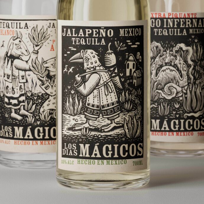
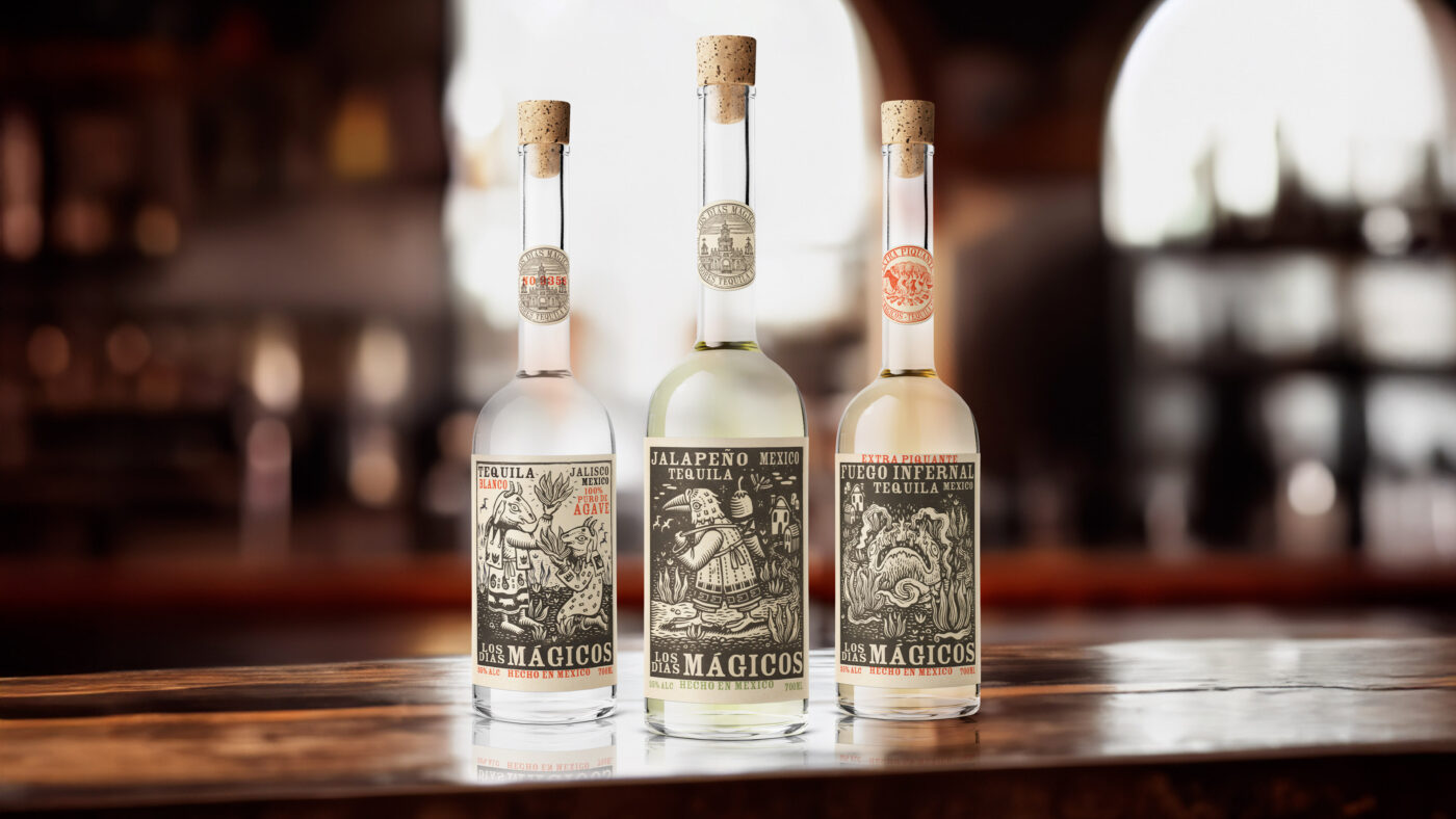
The popularity of tequila continues to grow exponentially, driven by everything from the continued demand for the margarita, to a growing interest in sipping tequila. Our client wanted to take advantage of this growth by introducing a new tequila brand that would combine both authenticity and innovation. The brand needed to look true to its origins in Mexico but have a strong personality to carry off radical product innovation within the range. The range would consist of Blanco, Jalapeño and Extra Piquante Fuego Infernal – a wholly fiery tequila that would test the bravest of consumers.
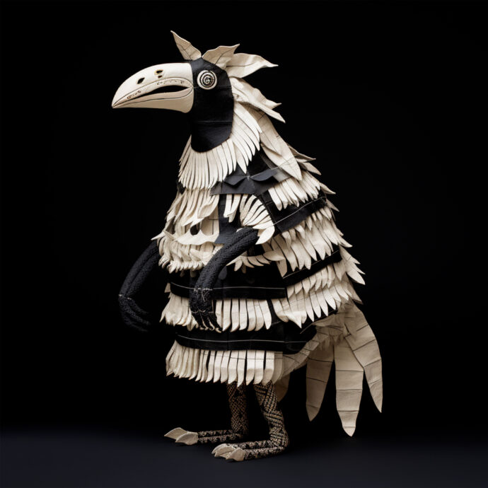
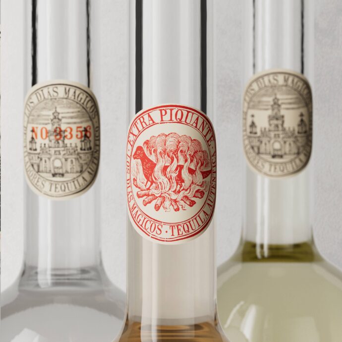
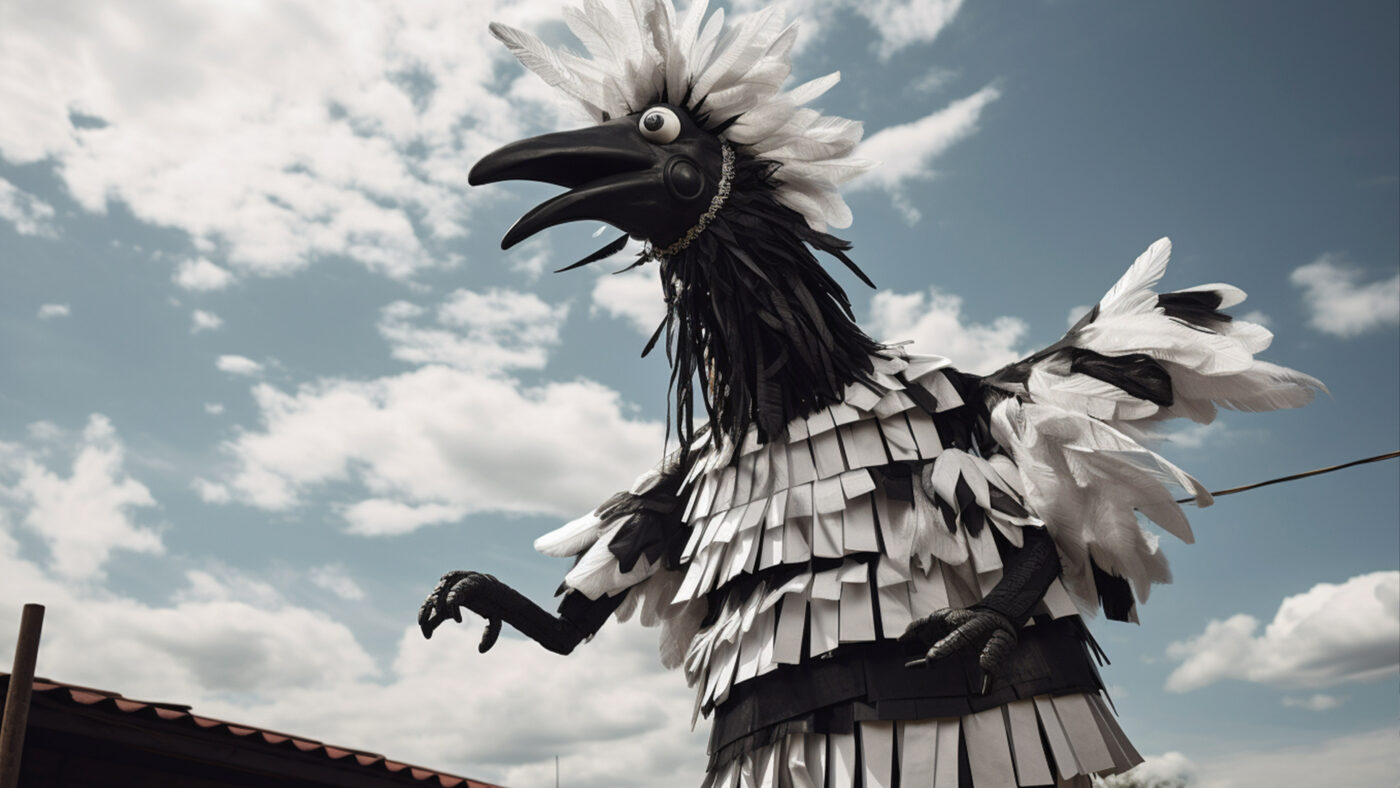
The town of Tequila is named “Pueblo Mágico”, so the name Los Dias Mágicos reflects both its history and place. We developed the brand’s positioning to be based on Mexico’s magical realism where interaction with Los Dias Mágicos would be slightly disturbing and unsettling for the consumer. In a category that is typically type-led, the use of bold and intense bespoke illustrations brings to life the character of each product, and creates a clear point of difference on shelf.
Echoing the creative approach, the type is unconventionally placed: breaking in and out of the illustration as though there was a shift in the printing plates. The typographic treatment is deliberately crude in its finish in order to look as hand-crafted as possible.
Sector
Spirits
Client
Fourth Wave
